

Design Smarter, Not Harder: Fresh Ways UI Designers Can Speed Up Their Workflow in Figma
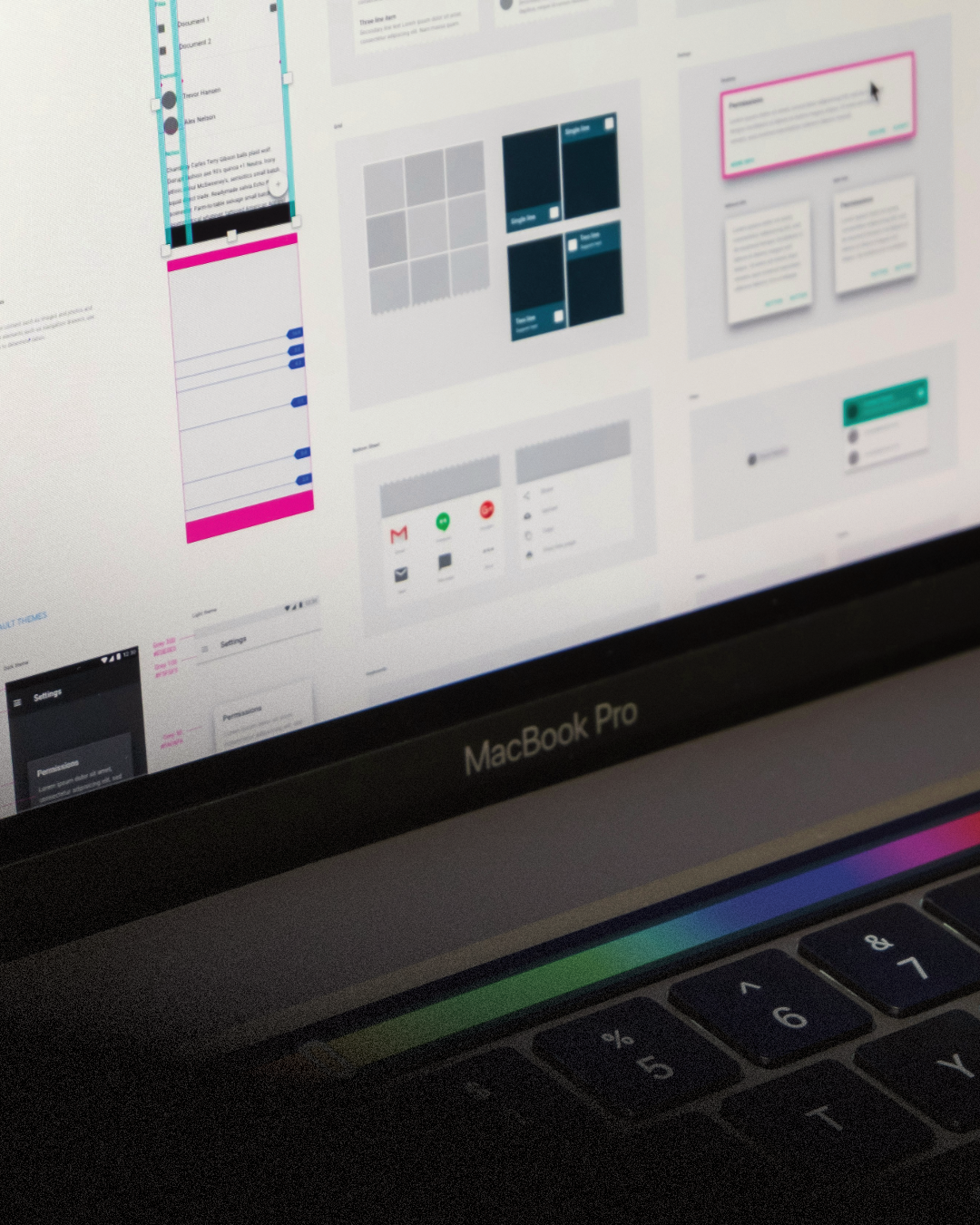
Designing beautiful, functional interfaces isn't just about creativity anymore. In 2025, it's also about speed, systems, and collaboration. As design tools evolve, so must our approach to using them. Figma has rapidly become the gold standard in interface design, but how many of us are truly getting the most out of it?
If you're a UI designer, you already know the feeling: juggling multiple screens, revising components again and again, or syncing changes while collaborating with developers or fellow designers. It's not that you aren't skilled, it's that the process can get in the way. But the truth is, Figma holds a treasure trove of workflow accelerators that are easy to miss unless you're intentionally digging for them.
In this article, we're going to explore fresh ways to optimize your design workflow in Figma. Not through rigid bullet points or generic shortcuts, but by walking through the mindset shifts, habits, and hidden features that can truly make a difference. Let's dive into how you can start designing smarter and faster, every single day.
Understanding the Real Bottlenecks
Speeding up your workflow isn't just about clicking faster. Sometimes, the biggest time-wasters are the things we overlook:
-
Rebuilding the same elements over and over again
-
Manually adjusting layout spacing or alignment
-
Designing without real content
-
Constantly switching between versions or fixing inconsistent components
If this sounds familiar, the good news is: there are better ways to work.
A well-oiled design process begins with reusability and foresight. Think less about how fast you can draw a button, and more about how you can build that button once and never draw it again.
Designing with Reusability in Mind
A major step toward working faster in Figma is embracing component-based design not just for buttons and inputs, but for every repeatable element in your UI. If you find yourself duplicating frames or tweaking the same spacing on every new screen, it's time to reconsider your approach.
Designing with reusable components isn't about limiting creativity. It's about designing more intentionally. Set up base components with variants, make smart use of constraints, and you'll find yourself spending less time nudging and more time crafting.
The power lies in combining components with Auto Layout. With well-configured Auto Layout, you're no longer worrying about pixel-perfect alignment or fixing things when content changes. Your design adjusts on its own intelligently and reliably.
The Magic of Variables
One of Figma's newer and more powerful features is the use of variables. Variables allow you to create scalable, adaptive design systems whether you're working on themes (dark/light), responsive sizes, or even localized text content.
Think of variables as a way to manage your design like code: define once, reuse everywhere. You can create a variable for your spacing scale (4px, 8px, 16px), a palette of colors, or even conditional logic in your prototypes.
Designers who embrace variables often say it feels like they're "designing smarter," not harder because that's exactly what's happening.
Auto Layout: The Backbone of Modern UI Design
If you haven't fully leaned into Auto Layout, now's the time. Yes, it can feel a bit robotic at first, but once you understand it, it becomes your best friend.
Whether you're mocking up a product card, laying out a settings page, or building a modal window, Auto Layout ensures that everything behaves like a real UI component would in development.
Better still, when combined with components and constraints, Auto Layout allows your design to scale, stretch, and shift gracefully across breakpoints and screen sizes.
In a collaborative environment where developers are referencing your files or your designs are handed off to product managers, Auto Layout keeps your files cleaner, more reliable, and easier to work with.
The Importance of Real Content
One of the biggest mistakes we all make? Designing with placeholder content for too long.
Sure, "Lorem ipsum" looks fine during exploration but it doesn't prepare you for real-world scenarios. By integrating actual text, names, data, and imagery into your early design process, you make better layout decisions from the start.
Tools like Google Sheets sync, content libraries, and plugins like Content Reel allow you to inject realism into your design. It helps with:
-
Visualizing the true hierarchy
-
Stress-testing layouts for overflow
-
Making stakeholder reviews more convincing
Designing with real content isn't a fancy trick, it's a productivity strategy that saves you from time-consuming revisions later.
Smart Prototyping Isn't Just for Presentation
Prototyping has long been viewed as the "presentation phase" of design. But in reality, it's part of the thinking process.
Modern Figma prototypes support branching, variables, and conditions making it possible to simulate actual user flows, from login states to onboarding experiences.
This lets you:
-
Catch UX issues early
-
Validate logic with teammates or users
-
Create more compelling handoffs for developers
You don't need to build full prototypes for every idea, but using even simple logic in early flows can help you design with clarity and purpose.
Keeping Things Tidy for the Long Run
One silent killer of productivity is messy files. We've all seen it: 37 artboards named "Frame 1 Copy 11" and hundreds of ungrouped layers sitting loose in the canvas.
Good organization may not feel urgent but it's the habit that saves you hours in the long run. Adopt naming conventions for your layers and components. Use pages to separate flows, states, or user types. Leverage comments and section labels to guide your team (or future you).
Clean files are a gift to collaborators and to your own mental clarity.
Collaborate Like a Developer
Speaking of devs, designers today don't just hand off static files, they collaborate in real-time. The more your design mimics the logic and behavior of actual code, the smoother the transition from design to build.
Designing with a developer mindset doesn't mean coding, it means:
-
Using grids and spacing systems
-
Naming consistently
-
Avoiding one-off overrides
-
Keeping interactive states within components
When developers can trust your files, you get fewer Slack questions and faster launches.
Final Thoughts: Mindset Over Tools
The biggest transformation in your Figma workflow won't come from a new plugin or a fancy UI kit. It comes from changing how you think about design. Are you solving a problem or decorating a screen? Are you designing for reuse or rebuilding endlessly? Are you anticipating change or fixing things when they break? Fast design isn't reckless design. It's strategic, thoughtful, and forward-looking.
When you internalize the mindset of design systems, reusability, and smart automation, your Figma workflow transforms. Not only will you be faster you'll produce more robust, scalable, and delightful work.
And let's face it anything that gives you more time to enjoy the creative parts of design is a win, right?
More from Enamo Studios
Enamo Studios is a design-driven creative studio focused on art direction, graphic design, and digital product development.