

How to Choose the Right Icon Style for Your Design System

Icons: Tiny but Mighty
Every design system has its foundations, colours, typography, spacing. But ask any designer who's built one from scratch, and they'll tell you: icons are where things get tricky.
Why? Because icons are emotional. They define the feel of an interface before a user reads a single word. A minimalist icon feels efficient. A rounded one feels friendly. A line icon feels light, while a filled icon feels bold.
So, how do you choose the right icon style for your design system? Let's break it down, from understanding your product personality to matching it with visual consistency and user experience principles.
1. Start with the Core of Your Brand Personality
Before picking any style, take a step back and ask: What kind of experience are we trying to create?
Just like typography, icons carry tone. Here's a quick visual personality spectrum to guide your thinking:
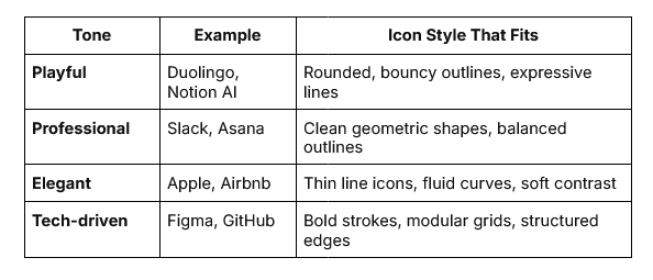
Bold strokes, modular grids, structured edges
If your brand feels approachable and human, go for icons with rounder corners and friendly proportions. If it's high-tech or enterprise, sharper angles and solid fills might express confidence and precision better.
The key is alignment, icons should visually "speak the same language" as the rest of your brand assets.
2. Understand the Major Icon Styles (and When to Use Them)
Most modern design systems use one of a few foundational icon styles. Here's a breakdown to help you decide which one fits your use case best:
a. Outline (Stroke) Icons
The most popular choice in 2025, outline icons are light, airy, and timeless. Perfect for dashboards, SaaS platforms, and mobile apps that prioritise clarity.
Pros:
-
Great scalability and readability
-
Works well on both light and dark themes
-
Clean and modern
Cons:
- Can feel too minimal in high-impact visual designs
b. Filled Icons
Filled icons (or solid icons) are bolder and carry more visual weight. They're often used for active states or emphasising primary actions.
Best for: Action-heavy apps, mobile navigation bars, and dark-mode designs. They also bring a sense of stability and boldness to interfaces.
c. Two-tone or Duotone Icons
This style introduces an extra layer of visual nuance, often by mixing two shades or adding subtle depth.
Pros:
-
Helps with state differentiation
-
Adds warmth and brand personality
Cons:
- Requires consistent colour management within your design system
Duotone styles work beautifully for marketing visuals or feature illustrations where you want icons to feel more expressive.
d. 3D and Gradient Icons
Once considered "too decorative," gradients and dimensional styles have made a comeback thanks to Apple's new fluid design direction and the trend toward more expressive UIs.
Use them sparingly in your system, often as accent icons or illustrative companions, not for every interface element. They shine in onboarding, dashboards, or marketing pages that need personality.
e. Hand-drawn or Sketch Icons
These convey warmth and playfulness, often used in onboarding, storytelling, or empty-state illustrations.
If your product's tone is lighthearted or community-driven, these can humanise your design system beautifully. But remember: they should feel intentional, not inconsistent.
3. Build Icons Around Your Design System Rules
Choosing an icon pack isn't just about aesthetics, it's about structure.
Every design system defines its geometry rules:
-
Stroke width (e.g., 1.5px, 2px)
-
Corner radius consistency
-
Grid size (commonly 24px or 32px)
-
Alignment rules (centered vs baseline)
Why it matters: If your icons don't align to your grid or follow a consistent visual rhythm, your interface will look slightly off, even if users can't explain why.
So before importing any icon library into Figma, test it:
-
Does it align with your base grid (8px or 4px system)?
-
Are strokes consistent across all icons?
-
Are corner treatments uniform?
-
Is the visual weight balanced between filled and outline variants?
A well-structured icon set blends seamlessly into your component library, like it was born there.
4. Test for Legibility Across Scales and Themes
A common pitfall: icons that look great at 64px but turn muddy at 16px. The key is legibility testing, especially across breakpoints and themes.
Here's how you can test efficiently in Figma:
-
Preview icons at 16px, 24px, and 32px to check clarity.
-
Switch between light and dark mode backgrounds.
-
Adjust stroke width or contrast when icons appear too faint or heavy.
Bonus: use accessibility tools to ensure sufficient colour contrast if icons rely on tone or gradient.
Your icon set should remain crystal clear whether it's on a smartwatch or a 4K monitor.
5. Think Systematically: States, Categories, and Expandability
A design system is never "done." So your icon library shouldn't be static either.
Before finalising your style, ask:
-
Can I easily add new icons without breaking the style language?
-
Does the system support variants (outlined, filled, two-tone)?
-
Are there guidelines for new contributions (naming, file structure, versioning)?
Great icon systems, like Google's Material Symbols or Streamline's library, are designed with scalability in mind.
In practice, this means:
-
Naming conventions follow component logic (icon/filled/mail, icon/outline/mail)
-
Icons use consistent grid and stroke logic
-
There's documentation explaining when to use what style
This foresight saves teams endless design debt later.
6. Balancing Consistency and Flexibility
Here's the eternal tension in design systems: Should every icon look exactly the same, or can they flex a little to express tone?
The answer: both.
Consistency is crucial for usability, but flexibility gives your system life.
For example:
-
Use strict consistency within your core product UI (navigation, buttons, actions).
-
Allow expressive variations for marketing, onboarding, or community pages.
This layered approach ensures your product feels unified without becoming visually monotonous.
7. Evaluating Ready-Made Icon Libraries
You don't always need to reinvent the wheel. Many professional designers start with prebuilt icon systems and adapt them to their product identity.
Here are some of the most popular ones in 2025:
-
Streamline Icons: massive, highly consistent library with flexible licensing
-
Feather Icons: simple, open-source, and great for prototyping
When choosing, focus on:
-
Style compatibility with your brand
-
File formats (SVG preferred for Figma workflows)
-
Licensing terms (especially for commercial use)
-
Update frequency (monthly or seasonal refreshes help maintain freshness)
Adopting a well-maintained library ensures you stay aligned with modern icon design trends 2025 while saving time and effort.
8. Integrating Icons Into Figma: Workflow Tips
Figma makes icon integration almost effortless, but a few workflow tricks can help your team move faster:
-
Create components for frequently used icons (e.g., navigation, states).
-
Use Variants to manage active/inactive or filled/outline versions.
-
Group icons into logical categories: "System," "Social," "Commerce," "Interface."
-
Use Figma's Team Library feature to share updates instantly.
For larger teams, define naming standards (icon/navigation/home, icon/system/error) so everyone can search easily.
This turns your icon library into a living design asset, versioned, documented, and reliable.
9. Future-Proofing Your Icon Style
Design trends move fast, what's minimalist today might look outdated tomorrow. To future-proof your design system, keep these habits:
-
Review annually: revisit your icon set once a year to assess relevance.
-
Document guidelines: note visual rules (stroke width, corner radius) so new icons stay consistent.
-
Stay inspired: follow icon trend reports, Dribbble shots, and Figma Community plugins for new ideas.
-
Update progressively: evolve styles slowly to avoid user confusion.
The best design systems grow like good architecture, solid foundations with room for renovation.
10. Wrapping Up: Choosing Icons Is Choosing Identity
Selecting an icon style might seem like a small design decision, but it's one of the most visible ones users experience. Each icon, no matter how small, communicates tone, trust, and intent.
When done right, icons blend seamlessly into your brand, becoming invisible guides that make your product feel natural and coherent. When done wrong, they stand out like a misplaced word in a sentence.
So choose with care, document with clarity, and iterate with purpose. Because the right icon style doesn't just fit your design system, it defines it.
More from Enamo Studios
Enamo Studios is a design-driven creative studio focused on art direction, graphic design, and digital product development.